 Questions swirl around US plans for record $15B Prince Group crypto seizure
  Donate to ICIJ
  Chelsea FC fined millions over secret payments under Abramovich ownership
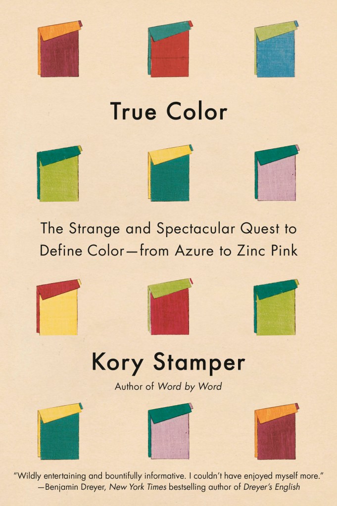
Kory Stamper| Longreads | March 19, 2026 | 3,830 words (16 minutes)
This is an excerpt from True Color: The Strange and Spectacular Quest to Define Color–from Azure to Zinc Pink by Kory Stamper, which will be published by Knopf on March 31, 2026.
When I was hired by Merriam-Webster in 1998, it was ostensibly to revise the Big Book, Webster’s Third New International Dictionary, Unabridged. The Third, or W3 as it’s called in the office, was released in 1961 and it made a splash. A dictionary written for the nuclear age, it’s 2,662 pages of six-point type, 10 pounds of knowledge stuffed between two buckram-covered boards, the result of tens of thousands of editorial hours by more than a hundred in-house editors and two hundred outside experts. It’s a nonpareil of twentieth-century American lexicography, notable for its almost scientific, systematic approach to what belongs in a dictionary and how the words inside it should be defined. Every modern American dictionary that you’ve consulted owes something to the Third—even if that something is that the dictionary you’re consulting is not the Third.
I say “ostensibly” because every editor who had been hired at Merriam-Webster since the mid-1970s had been hired to revise the Third, but no work had been undertaken on a full revision of the beast since its publication. New words had been added by means of an Addenda Section slapped into the front of the book—editing this was, in fact, my first defining job as a lexicographer—but the original A–Z remained relatively untouched. Nonetheless, every editor who crept quietly up the stairs to the editorial floor and took their creaky seat was trained using all the same techniques and style sheets used to write the Third. When you wrote practice definitions, they were graded on the curve of the Third. Not sure whether the usage label for this archaic term for the female genitals should be “dialectal, chiefly England” or “chiefly British dialect”? Lift up thine eyes to the Third. Every other dictionary we wrote, from the mass-market paperback to the Collegiate, owed its existence to the Third. This was done not because we love tradition, or because the Third was such a big deal that we could never deviate from it, but in anticipation of the big day when the stars would align and the market would be ready for another big ol’ buckram-covered computer-monitor stand. When that day came, every lexicographer on staff would have to drop everything and swan dive gracefully into the complexities of the Big Book.
In 2010, almost 50 years after its initial publication, the stars aligned. We bounced on our toes, took a deep breath, and began the unending work of revising the Third into a new unabridged dictionary.
That is when my love affair with color began.
One of the jobs of a lexicographer is to proofread dictionary entries. This task is more than simply reading each word in an entry: Proofreading dictionary entries includes finger stepping your way through each etymology to make sure that the dot underneath that h is supposed to be there and isn’t just fly poop, verifying that the angle brackets which introduced an example sentence were in roman and not accidentally italicized (because even though no one but a professional typesetter would ever notice it, it’s still wrong), and checking that the initial colon which starts that six-point-type definition is in boldface and surrounded by exactly one space on either side—and not an en or em space, either. It is brain-melting tedium on a microscopic scale, and I enjoy it immensely.
I had been asked to proofread some changes and new additions we had made to entries in the letter B, and make sure that they were being translated properly for the website that housed the new-but-in-progress Unabridged Dictionary. I started at “Beaufort scale” and began plodding my way through the word list, noting whenever an etymological character was rendered incorrectly, a link to a table was broken, or a fat-fingered extra space in the code resulted in a blank page. This is exactly what I had trained for: to be able to spot minute errors in transliterating the Third without needing to study the page.
The Third has a very distinctive defining style. Dry, impersonal, a little robotic to the point of hilarity. Gone are whimsical, snappy definitions reminiscent of Samuel Johnson, the eighteenth-century lexicographer who famously defined “oats” as “a grain, which in England is generally given to horses, but in Scotland supports the people.” The Third was no-nonsense and all business, full of “the state or condition ofs” and “of, relating to, or characterized bys.” No narrative interest, no silly puns, no personality whatsoever—just exhaustive definitions that look as if they were written by very articulate alien visitors to earth. That is the ultimate goal of every definition in the Third. This is a dictionary that expanded the food-related meaning of “hunger” into three separate definitions, one of which was “an uneasy sensation occasioned normally by the lack of food and resulting directly from stimulation of the sensory nerves of the stomach by the contraction and churning movement of the empty stomach.” This is a dictionary that defined the word “fish stick” as “a stick of fish.”*
* Originally, at any rate. It is now defined a little more sensibly in the online Unabridged Dictionary as “a small, elongated, breaded fillet of fish.” Requiescat in pace, bad definition.
So you will perhaps understand why the entry for “begonia” caught my eye. Two botanical definitions, as expected, with all hyperlinks working and all acute accents in the etymology intact. Then I came to the third definition in the entry:
3 – s : a deep pink that is bluer, lighter, and stronger than average coral (see coral 3b), bluer than fiesta, and bluer and stronger than sweet william—called also gaiety.
I blinked. I read it again. The definition sure fit the form of a definition for the Third, but it was utter and complete nonsense. Here was a color—“a deep pink”—compared color-wise to a handful of things that I was pretty sure were not colors. “Sweet william” I recognized as the name of a flower, so maybe there was also a color called sweet william that was based on the color of the flower. I googled “sweet william” and the first picture that showed up was of a hedge of flowers that were white, bright magenta, dull purple, middle-of-the-road pink, and even a dusty, blue-tinged lilac. Which of those sweet williams was “sweet william”? This was not an auspicious beginning. “Fiesta” I recognized as a party—mariachi bands and fireworks and piñatas. There is no color associated with a fiesta, apart from maybe all the colors, as befits a party. Maybe this “fiesta” was referring to the original color of Fiestaware, the brightly colored tableware from the ‘1940s that every grandma in the American West had a set of in the cabinet. But I was still stumped. Being neither from the ‘1940s nor a grandmother in the American West, I had to default to what I knew: “Fiesta” was a big ol’ party. At least, I reasoned, I recognized “coral” as a color. But what the hell was “average” coral? “Average” implied the middle of a range, but what were the two ends of this particular range? Light and dark? Dull and bright? Orange and purple? Was “average” here referring more to the top of the bell curve—the most common color in a group of very similar colors that we call coral? Are there even enough corals to make a group of colors all called coral? I began wondering if there was “excellent coral,” or “moderately disappointing coral.”
There’d be an easy way to figure this all out. I whumped open my desk copy of the Third and began looking for the inevitable color chart that would explain the difference between “average coral” and “fiesta.” There is a two-page color plate near the entry for “color” that includes exactly zero color chips named “average coral” or “fiesta.” In fact, it contained no color chips at all: just a picture of the visible spectrum and a weird, multicolor blob from two sides.
Mine not to reason why, mine but to proofread and die: I clicked on the hyperlink at “see coral 3b” to make sure it worked, and was greeted by this:
3 : something bright red in color: such as
a : a bright- reddish ovary (as that of a lobster or scallop); also : the cooked roe of a lobster
b : a variable color averaging a deep pink that is yellower and duller than fiesta or begonia and yellower and darker than sweet william
c of textiles : a strong pink that is yellower and stronger than carnation rose, bluer, stronger, and slightly lighter than rose d’Althaea, and lighter, stronger, and slightly yellower than sea pink
* Congratulations: You’ve encountered your first bit of dictionary jargon! “Sense” here refers to the numbered definitions inside a dictionary. Impress your boss/friends/pets with your newfound knowledge.
Yes, there’s the mirror of “begonia” in sense* 3b, but what fresh VistaVision glory is sense 3c! No longer words on a page, I was tumbling in and among those color names, bouncing around between sense memory and fantasy, utterly transported. Carnation rose! A close-up of the Carnation evaporated milk can popped to mind, that red-and-white label with the blue lozenge proclaiming that what was inside was “MILK,” and scattered under the red banner, those eponymous flowers, in dark red, white, and what must be carnation rose. Rose d’Althaea! With that floral first name and that surname a jumble of extra vowels and strange capitalization, this is the color named after Scarlett O’Hara’s well-to-do cousin from the French side of the family, the side not mentioned in Gone with the Wind, the cousin who attended cotillion in a silk dress the color of unopened magnolia blossoms and the next year abandoned Dixie and family to marry some damned Yankee.
But it was “sea pink” that undid me. The utter ridiculousness of it: the “sea,” which I had understood to be a variety of blues, greens, grays, and other assorted not-red colors; and “pink,” that Barbie doll, Pepto-Bismol, Material Girl, definitely not-blue color. Sea pink. I placed my hands very gently on my desk, then mouthed the words “sea pink” to myself and hoped that I could suppress the riptide of laughter which was sucking me—a team player who worked in a silent office—under. “Sea pink,” I mouthed again, and this time the laughter hitched a ride with the s of “sea pink” and seeped out of me until I sounded like a leaky tire bouncing down a road of p’s and k’s.
The co-worker who sat in the cubicle behind me slammed his newspaper shut and stomped off to find a non-sibilant corner where he could continue to read without listening to me chuckle like a loon. I wanted to stand up and yell after him, by way of explanation, “I grew up fifteen hundred miles from an ocean! I didn’t know the sea was pink!”
From that day forward, my workday breaks were filled with a Technicolor romp through the Third. Tired of proofreading for a bit, I’d pull up the beta website for the unabridged and wiggle my fingers over the keyboard in invocation. Let’s start at “aqua” this time, I’d say, and then I’d follow all the other colors listed in the definition through the dictionary and learn that “robin’s-egg blue” is two different colors; that “cobalt” wasn’t just blue, but could also be red, yellow, green, or violet; that “mallard” isn’t a color but “duckling” is.
Part of what was so entrancing about these definitions was that they had a voice. The Third was carefully designed not to have any voice apart from the Corporate One. These color definitions—compared with the staid and rigid style of the rest of the Third—were as flashy as an entire team of cabaret dancers. They were unlike any other color definitions in any of our dictionaries. In fact, they were unlike any other color definitions, period. I had been involved in the creation of dozens of dictionaries at that point and had even written definitions for colors before. The idea was to aim in a spectral direction: “a bright red,” “a moderate blue.” Where in the bluer, yellower, slightly stronger hell had these extensive definitions that referenced “sea pink” and “copen” and thousands of other colors that I, a woman whose job was to read everything within reach and had never heard of before, come from?
The answers to these questions lay in piles of correspondence moldering in the Merriam-Webster basement; in family papers tucked safely away in archival boxes; in neatly typed notes in corporate archives; in long-out-of-print books; in government documents and reports to and from Congress; in fabric swatches and chemistry equations. Each one of these definitions is the crystalline, whittled-down result of dozens of overlapping concerns: the reach of science in the 20th century, the commoditization of color, the scientism of American society and the inevitable backlash, the place of dictionaries in our cultural consciousness, the governmental foray into standardization, the insufficiency of language to describe the abstract, the drudgery of typesetting, the impact of war, the dangers of dye works, the power of love, and the ineffability of sea pink.
It’s human nature to categorize. It’s one of the easiest ways to make sense of the dizzying experience of being on this planet, and it’s proven useful as we have made our way through history. This large furry mammal with the roar and the stripes and the long teeth will kill me, we say, while the smaller version of that furry mammal will merely live in my home and knock things off my shelves while it stares me straight in the face.
One handy marker we’ve used in categorizing things is color. It’s such an elementary marker that it’s also one of the first categories we teach our children. Panthers are black, pumas are brown, and tigers are? “Orange and black!” our preschoolers holler, and we beam with pride. (We will wait until they are in elementary school before we tell them that tigers can also be white and black, like zebras.) Color is so integral to our experience as humans that we can’t conceive of a world without it. It’s as much a part of our lives as air, water, and taxes. And it is maddeningly, beguilingly slippery.
Color is so maddening, so beguiling, because what we think we know about color contradicts how we experience it. Rainbows occur only when physical conditions are right—water particles suspended in the atmosphere at the right density, cloud cover broken enough to allow light to reach those water droplets, eyeballs turned skyward to perceive—but try to grab a rainbow, and nothing’s there. Shine a red light at a wall and overlap it with a green light, and you get yellow light; slap some red paint on a wall and overlap it with green paint, and you get mud (assuming the red and green paints are both wet, and that you’re mixing them on the wall well, and that the wall is nonabsorbent, and that the paint is not glossy, and and and). White and black, which we are accustomed to thinking of as not colors, are actually all the colors of the visible spectrum either entirely present and bouncing back at your retinas (white) or entirely absent and being wholly, greedily absorbed (black). We pass our cell phones around and look at a blurry picture of a striped dress that a stranger posted to the internet, and then holler at the one person at dinner who says that they think the dress is blue and black, because oh my God, it’s obviously gold and white, what is wrong with you, are you color-blind?? We are so immersed in color that when someone has even the slightest impairment in the way they see color, we say they are color-blind.
*Actually from the full spectrum of electromagnetic radiation, but most people are just interested in the visible spectrum, poor slobs.
The science of color is also maddening for the same reason. Color, the physicist tells us, is a trick of light. Certain wavelengths of light from the visible spectrum* are reflected, refracted, or absorbed by the things they come into contact with: the ball on the floor, the floor, the wall behind the ball, the particles of dust in the air between you and the ball, the pollutants and water vapor in the atmosphere between the sun and you. Simple. Up pops the biologist to say that it’s not quite that simple, because without the right combination of photoreceptors in the retina, a healthy retina, a solid optic nerve, a clear lens and healthy cornea, yadda yadda yadda—without the complex mechanisms of the human eye, we wouldn’t perceive any of that light as color. And before the physicist can argue, a neurologist peers around the corner to say that color is a sensation generated by our brains to interpret the neural signals from the retina caused by light, and so, really, color can’t happen independent of human cognition. You turn to leave and a psychologist blocks your exit and, as they push you back into the room and the horror-film music begins, tells you that the psychophysical sensation known as color is dependent upon the other color sensations your brain is interpreting at the same time, the language you assign to that sensation, and whether you are synesthetic. But how can you know, you say, voice rising into a shrill, that all of this works the same way in each person? They crowd in and you begin to hyperventilate: Everyone’s brain is different, so how can we know that the blue I see is the blue everyone else sees?
The room goes dark. No one can see your face turn pale; color is a function of light.
People tend not to like things that are so damned slippery, so we try our best to make sense of it, and one way we do that is by putting words to the sensation we’re having right now. We use language all the time to help us make sense of the world: It’s one of those things that’s proved useful. This large furry mammal with the roar and the stripes and the long teeth that will kill me—that I am going to call tiger. The smaller version of that furry mammal, the one that will live in my home and knock things off my shelves while it stares me straight in the face—that one I am going to call kitty. When I use the word “tiger,” you will know to run away; when I use the word “kitty,” you will know to run toward your shelves to save your knickknacks from gravity-induced destruction.
But language, like color, is also more complicated than we think. Look to your left, where there is suddenly a raccoon. You are startled; you holler, “Oh my God, a raccoon!” The early twentieth-century scholars C. K. Ogden and I. A. Richards pop up from wherever the raccoon came from, freeze-frame this episode, and dissect it into what they call the “triangle of meaning,” a psycholinguistic series of interactions among three things.
There’s the referent; that’s the raccoon. There’s the thought; that’s the recognition that the thing you just saw was a raccoon. And there’s the symbol; that’s the word “raccoon.” All three of these things exist in relation to each other, kind of like the points of a triangle, but their relationship isn’t equal. There’s a solid line between the thought and the referent: The recognition that the thing you saw is a raccoon is caused by that thing actually being a raccoon. And there’s a solid line between the thought and the symbol: When we think of raccoons, we automatically attach the word “raccoon” to the thought. But there’s a dotted line between the referent and the symbol, because we recognize that the word “raccoon” only represents the critter digging through your trash with its freaky little hands. I could use other symbols for that same referent—the German Waschbär, the Spanish mapache, the taxonomic name Procyon lotor, the ASL sign for “raccoon.” The point is that whatever I use, the word or sign itself is not the actual raccoon, which has left our frame of reference so it no longer has to put up with you shrieking at it or me blathering on about the philosophy of meaning and observation.
But the triangle of meaning gets wobbly when we apply it to color. Look out over a river and unhook your brain from the word “river” for a second. Just look at this one spot that is not water, you are not looking at water, and tell me what colors you see: yellow and gray and green and white. Now tell me what color the river is, and you will say “blue,” because water is canonically, unswervingly blue. But why? The river is blue because water is blue. If you have survived high school science, you may start burbling about wavelengths and reflectance and say the color of the sky has something to do with it, I think? Like the rainbow, there’s physical stuff that happens to make water blue. But why, I ask, is a glass of water clear and not blue? And then we both stare back out, moderately dissatisfied, at this big muddy streak of water that is definitely not blue.
Color is so much a part of our experience that we’ve drawn over the dotted line of Ogden-Richards’s triangle of meaning. Water is blue; oranges are orange; a tree’s leaves are green until they are red. Color is intrinsic to the thing we’re looking at. Plato himself told us that the only two things that an object truly has are form and color, and we all know how smart Plato was! I know that orange is orange as surely as its name is orange.
Combine these two things together—the hardwired connection between a color sensation and the name we give to that sensation, and the complexities of understanding how the external world, our bodies, and our brains somehow produce this sensation we call blue—and you get a lot of weird claims about color. Did you know, says the person who has read too much internet, that the ancient Greeks couldn’t see blue, because they had no word for blue? Did you know that we didn’t see orange until the fifteenth century when the word “orange” came into English? Have you heard about the Himba people of Namibia, who can’t distinguish between blue and green, because they have only four words for all color? And even as you make a confused face and get ready to make a noncommittal noise of disagreement, you stop. All of these claims seem ridiculous, but it’s color. Color is odd. You were the person who thought the dress was black and blue, after all.
Copyright © 2026 by Kory Stamper. Published 2026 by Knopf. All rights reserved.
Kory Stamper is a lexicographer who has written dictionaries for nearly thirty years at Merriam-Webster, Cambridge Dictionaries, and Dictionary.com. She is the author of Word by Word. Her writing has appeared in The Guardian, The New York Times, New York, and The Washington Post, and she blogs regularly on language and lexicography at www.korystamper.com.
Editor: Brendan Fitzgerald